Jim Rugg's "Hulk: Grand Design" Celebrates Comics

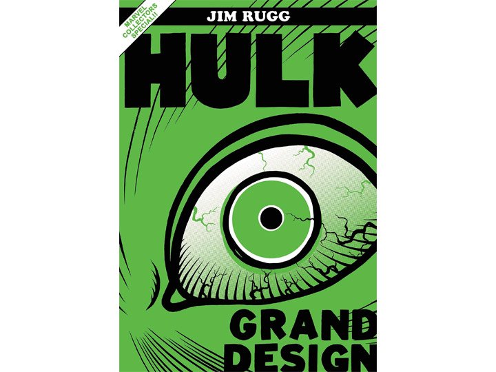
Cover to “Hulk: Grand Design Treasury Edition” by Jim Rugg
The comic artist unifies the story of The Hulk, underlining some basic truths about comics in the process.
Hulk smash.
In Hulk: Grand Design, comics artist Jim Rugg discovered that those two words told much of the Marvel superhero’s story. “Up to about issue 300, it was Monster of the Month Club,” Rugg says. “There’s not a lot of development and Hulk is basically a mindless monster. He doesn’t change much.”
His Grand Design project is the third in a series that takes decades of issues written and drawn by many people and treats them as one unified story. Like the Grand Design books done on The X-Men and The Fantastic Four, Rugg’s Hulk: Grand Design shows that the writers of the monthly comic often didn’t overthink their stories, cycling back to familiar territory on a regular basis. Rugg’s summary of Hulk’s story boils down to regular attempts to deal with the Hulk’s Jekyll and Hyde relationship with his human form, Bruce Banner, frequently with additional blasts of the gamma rays that created Hulk in the first place. Another gamma-irradiated villain, The Leader, is frequently part of that attempt, and they often backfire and only make Hulk stronger and/or madder.
The way Hulk: Grand Design exposes those limits can feel like a meta-critique of Hulk and mainstream comics, but that’s not the overriding takeaway from Rugg’s book. Hulk: Grand Design Treasury Edition—the oversized collection of the story originally published in two volumes—reads like a love letter to comics.
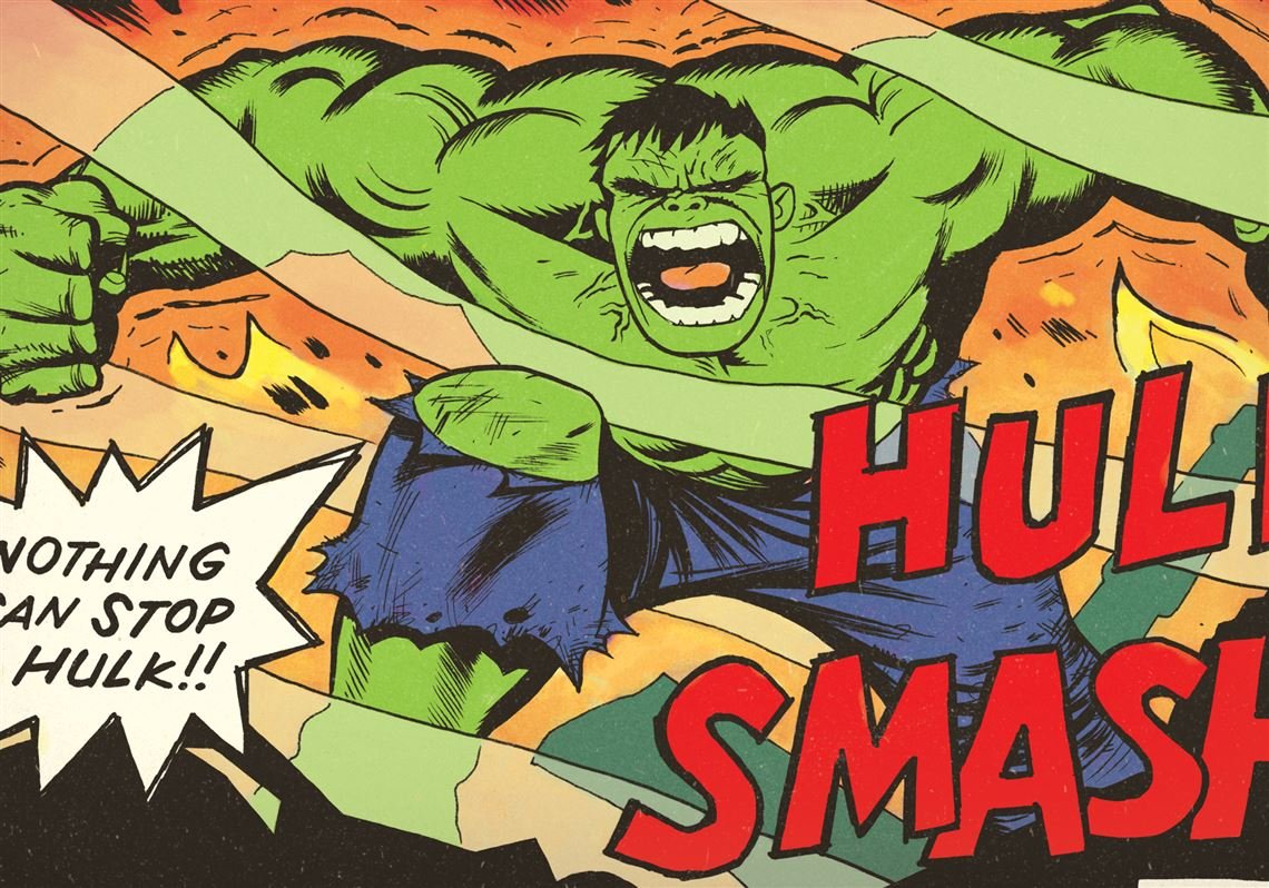
“Hulk Smash” panel by Jim Rugg
Rugg dedicates a lot of time and energy to comics. In addition to writing and drawing them, he cohosts “Cartoonist Kayfabe” on YouTube. Every weekday, he and fellow comic artist Ed Piskor scrutinize pages of comics, breaking down the visual storytelling with an artist’s eye. Their experience as working artists helps them appreciate the creative choices made by the artists, and because they’ve done the job, they’re instinctively generous to their subject, amused rather than outraged by some of the less successful moves. As fans, they want to turn people on to the comics they love. As professionals, they want people understand what makes the work special.
Rugg’s Grand Design isn’t simply kind, though. In the Treasury Edition, he uses every part of the comic in the book’s design, creating wallpaper from covers, pulling highlights from the letters pages, and even collaging together teasers for the next issue, many of which promises that the story would be “Hulk-inued.” His background is in print production, and that experience influenced the way he thinks about his comics in a time when more and more comics are read digitally on iPads.
“If it’s going to be printed, you want to make it worthy of the trees you’re cutting down,” he says.
Close-up of Jim Rugg’s recreation of the cover of “The Incredible Hulk” #181
Rugg’s affection for the Hulk started before he had ever read a comic. “When I was a kid, like most kids I liked monsters and dinosaurs and Godzilla and King Kong,” he says. “I ended up with a Hulk cereal bowl and cup when I was six years old, and I remember every morning that’s what I would drink my juice from and eat my cereal out of.” On the back of the bowl was a telling of Hulk’s origin story, and that’s the version that Rugg used on page one of his Grand Design.
At the time, The Incredible Hulk television show with Bill Bixby and Lou Ferrigno was in reruns, and that was Rugg’s connection to the character—as a cool monster. “It would be a couple of years before I realized that there were comic books of this character.”
Rugg was already drawing wrestlers and movie characters before he started reading comics. It wasn’t until he was 12 that he finally decided to pick one up, and by the time he got home with it, he had decided he wanted to be a comic artist. “How to Draw Comics the Marvel Way was one of my first five comic purchases,” he says. He read comics and stayed with them, but his interest was in the art not the story, and he was trying to figure out how the artists did it.
He got hooked on the Hulk comic book around issue 324 when writer Peter David moved Hulk to Las Vegas where a smarter, more verbally expressive Hulk got a job as a mob enforcer named Joe Fixit. He settled in Vegas to try to keep from changing back to Bruce Banner, and while there got a girlfriend. “The gray Hulk in a suit—Who is this guy? What’s going on here? He’s intelligent,” Rugg puzzled. He had to know what was going on, and in that way Joe Fixit Hulk became Rugg’s gateway Hulk.
That storyline was very different from the Hulk Smash battles with Zzaxx or Bi-Beast or Quintronic Man in the 1970s, and when Marvel asked for Grand Design pitches, that dichotomy made Hulk a no-brainer for Rugg. He released the story in 2022 as two books, the first subtitled “Monster” and the second “Madness. The dividing line came around issue 312 when writer Bill Mantlo attributed Hulk’s rage to the fact that Bruce Banner was abused as a child. “Peter David picks that new development up and runs with it, and the result is ‘Madness,’” Rugg says. Subsequent writers followed Mantlo and David’s leads.
“He’s not an anti-hero,” Rugg says. “He’s not the cool heel. He’s a monster. He’s a force of nature, a weapon of mass destruction.”
That realization affected the way Rugg felt about Bruce Banner, Hulk’s alter ego. Since Banner didn’t usually share Hulk’s consciousness, he would find himself half-naked with no idea how he got there or what he had done when Hulk relaxed enough to revert to his human form. “It would be absolutely horrifying,” Rugg says. “For all he knows, Hulk may have leveled a city and killed 10,000 people.”
As he says this, Rugg recalls that Hulk: Grand Design was his COVID lockdown project and laughs. “I think some of that loneliness found its way on to the page as well.”
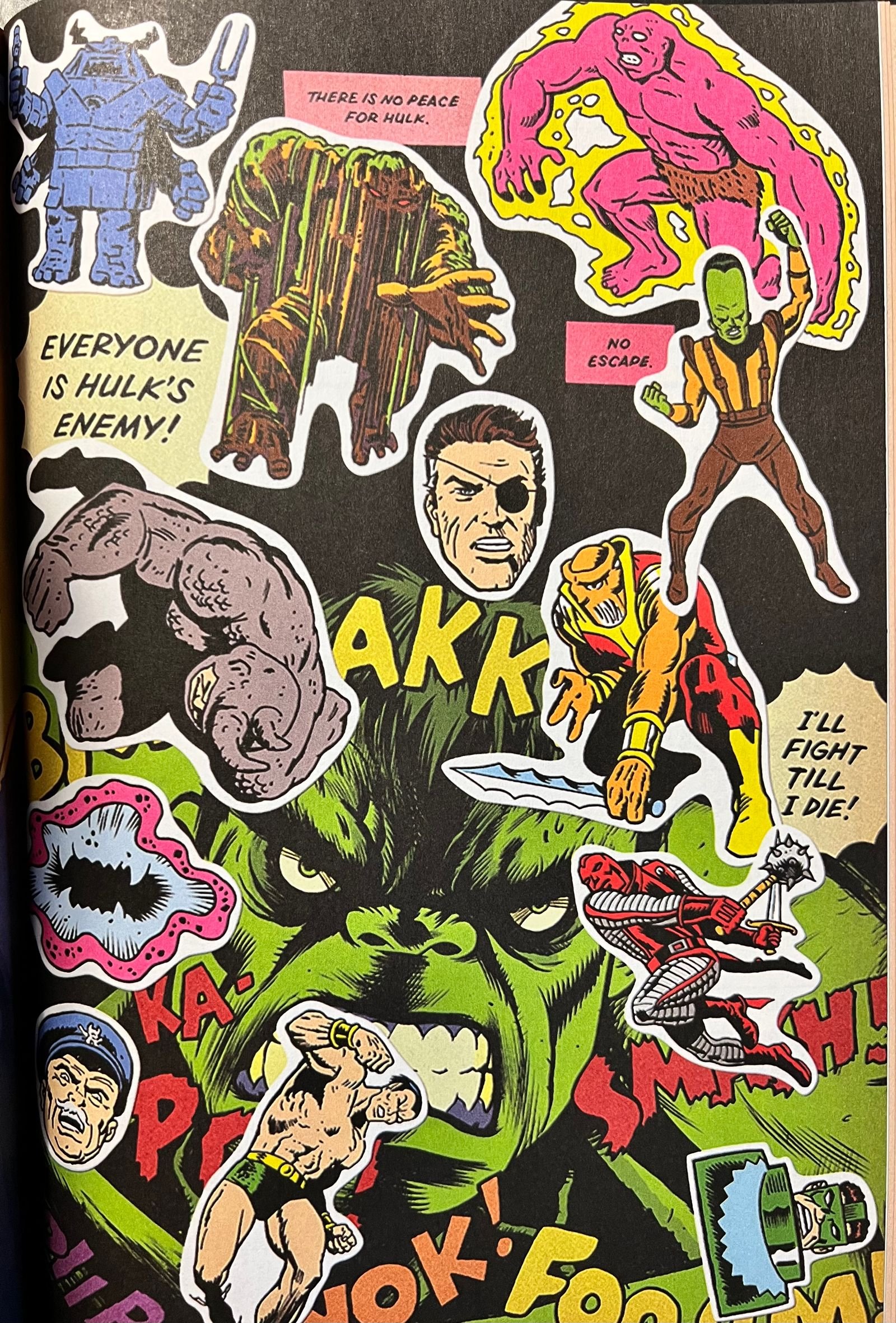
A page from “Hulk: Grand Design Treasury Edition” by Jim Rugg
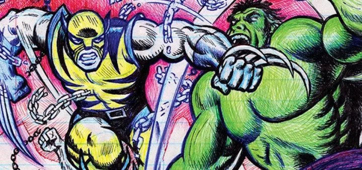
At first, Rugg sent his editor at Marvel pages and emails and kept in touch, uncertain of how to work with company on a project like this one. After a while though, the encouragement and lack of stop signs emboldened him to make more novel choices. At one point he recreates in ballpoint pen on notebook paper the cover of the issue that introduces Wolverine, the way countless schoolboys did with far less dexterity. He burned through a couple of unmemorable years of mediocre villains on one page by representing them as stickers over an image of an angry Hulk.
He designed each page to work on its own, in part because as a book designer he wanted to make a striking book, but that approach also solved a problem. “I knew the story was going to be in Cliff’s Notes style, so what could the art do to pick that up?” he wondered. Rugg illustrated the time when everybody blamed Hulk for the death of Nick Fury by creating a cover for a fictitious comic, complete a hand-written “You suck” that a kid might write on a comic. Rugg planned to reference the Hulk television show that aired in the late 1970s on one page, but that was one of the few things his editor balked at because Marvel didn’t have the rights to the actors’ likenesses.
The idea of the Grand Design is to unify the story, but Rugg cheated a little. Rather than settle on the look of his Hulk, he drew him in homage to the different phases of the series. Jack Kirby’s initial Hulk from 1962 was a gray Frankenstein caveman, so Rugg’s is too at first. But as the story goes on, fans will recognize Hulks with Herb Trimpe’s sinewy strength and Sal Buscema’s amiable balance. By the late 1980s when Hulk was treated like a destructive force of nature, Rugg followed the lead of artists who abandoned conventional human proportions and musculature to present him as an angry green tank.
“This is kind of a weird job, making comics,” Rugg says, and as an independent creator, he chooses jobs that give him a chance to draw things he wants to draw. In Hulk: Grand Design Treasury Edition, he reprints two pages of interpretations of Hulk by such legendary Marvel artists as Jim Steranko, John Buscema, Bill Everett, John Romita, and Gil Kane. “These talents that came through, they stuck with me more than the characters,” Rugg says.
Superheroes including Hulk were deliberately not literary for most of their runs, and they weren’t about growth and change. The writers were paid to tell a short, exciting story that kids could get, and artists were paid to make it look cool. But the many hands that drew the Hulk unintentionally added dimensions according to Rugg. Each version is shaped by what the artist sees as the most important characteristics of the Hulk, so “over the decades, you see Hulk from so many different versions that it almost creates the rounded, three-dimensional character visually,” he says. “As a fan, that’s my favorite stuff.”
It’s tempting to see slack, uninspired storytelling in much of Hulk’s run, but really, what Rugg’s efforts to unify the story reminds us is that in 1961, comics were considered disposable entertainment for kids. Printed on newsprint, nobody at Marvel was thinking about the comics lasting long enough for anybody to read them 60 years later, much less organize them into a coherent whole. While doing research, “I was reading 20 issues a night,” Rugg says, laughing. “They were not meant to be read that way.”
While reading the entire run of The Incredible Hulk, he could see when Marvel realized their readers were young teenagers, then older teenagers. Saying that the stories became more mature would be too generous, but they became more complex and involved. Hulk smashed. Hulk will smash. Hulk might have smashed.
Creator of My Spilt Milk and its spin-off Christmas music website and podcast, TwelveSongsOfChristmas.com.
